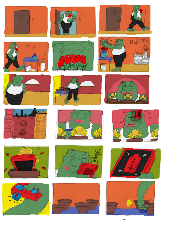
Todays update is just a fun picture I’ve put together with the key frames from my most recent shot. I am happy to day the shot is FINAL. Well the animation is, the background is still being tinkered with.
FRANK production blog 36
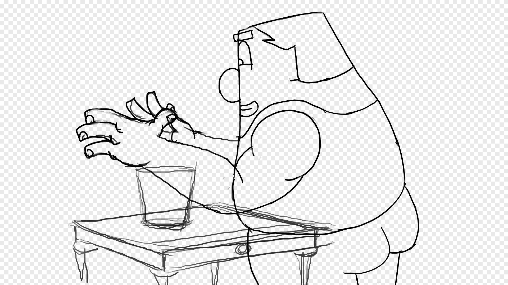
Todays update consist of the current scene i’m cleaning up. Below are a few variations on the scene.
The first one is from a more profile angle. He drops the flowers and walk off to the right.
The second is a 3/4 over the shoulder angle and the one i decided to go with. He drops the flowers turns around and walks off screen towards the camera. This was original idea but I did board one other angle just to explore the scene. This angle won due to the fact that while I do want a linear visual style I didn’t want to fall into a hole and lose the audiences attention.
Below are some of the boards from both ideas. Blue is the original with the first version of the character
Below are some color variations on the background
pencil and paper, first draft of backgrounds
FRANK production blog 35
final draft of the scene
todays update is about one of the opening scene. Above is the final design still for scene. Below are a few different variations of FRANK smelling his roses.
We start with the first draft I did on a very old piece of hardware, about 3-4 years ago when I started putting together a rough animatic. My goal was to capture the movement of both FRANK and the roses.
1st draft, done on a very old cintiq about 3-4 years, got it from a friend as payment for a job
Next we have the 2nd draft done about 2 -3 years go, this draft is just cleaner but the movement stayed the same.
2nd draft, done about 2-3 years ago on a 13 inch cintiq, borrowed from a friend
We finally we have the 3rd version done about 2 year ago. Same movement but the roses have been cleaned up and detail has been included, making the next pass to be a simple clean up pass.
However the roses have been reanimated, I wasn’t happy with the shot so i decided to redo it, in the past I would have dreaded reanimation a shot, but after spending so much time with this project and my goal being to make it the best possible, I really did not hesitate on the idea. Once I said, I gotta re do this, I simply went and started. I knew it would take some time but it would be worth it. As of this post its almost complete.
3rd draft, done about 2 years ago
FRANK production blog 34
A still, drew this like one years ago maybe longer.
FRANK production blog 33
todays update is a simple color study on the city that FRANK lives in. A few different city concepts with some different mood exploration.
FRANK production blog 32
today update is about the evolution of a scene
below are three different variations of a scene. Only the first one is different. the bottom two only have updated animation but the cuts remain the same.
the scene is the introduction of the device into FRANKs life. It wasn’t a slap in the face for him, and the story was it came from his neighbor, who had himself just experience the device and was over it. I liked the idea that it was being passed down from one person to another. this was from the first draft which was a longer story.
this variation had a reduced number of cuts. as the project evolved I started to remove things from the story. I am fascinated by directors who can tell a story with very little. part of the reason for doing this was to experiment with the story telling and to shorten the film and it’s production.
this third animatic variation has updated animation but the cuts remain the same. at this point I have decided that I will keep it this way. I feel as though I have stripped away everything that can be removed without telling a different story. I removed the neighbor because in the end I felt he wasn’t that important. FRANK and the device are the stars and how they come to meet is something I hope I have done a well enough job on.
At this point all these scenes have been fully cleaned up and are ready for color. I have not updated the animatic yet, but I will soon enough. I feel great with where I am in production and how the scenes are turning out. I do miss the old story a bit, but this being a solo project I have had to make decision that have trickling effects. I am however very excited with what the final will look like.
FRANK production blog 31
today update is a back ground and a few of its versions.
below is one of the wide shots of FRANK’s apartment. it is also the first time the we see his brick wall and window. this was one of the first backgrounds i drew when coming up with the story, its concept is pretty simple. i have always loved brick structures for many reason, one reason being brick will last a really really really long time signifying strength and endurance. its many small pieces fitted together to prop up one large structure. all the metaphors a side brick is made from the earth and have many color variations, these two things alone where enough for me to select it. i also dated a girl who lived in an old Brooklyn apartment with a brick wall…(there is definitely something subconscious there)
almost final version, done in tvpaint
early draft for animatic usage
first draft, done on animation paper with pencil and ruler
FRANK production blog 30
todays up date is a color study for our big lovable green guy FRANK
i knew from the beginning of my film that FRANK would be green. for many reasons, one being his design influence is the incredible hulk. also his connection to his plants made it natural to go with green. so below is a fun little spread i put together of a few different green shades. im pretty certain about the final color selection but which one do you like best?
FRANK production blog 29
todays update is some background comparisons on a scene i am currently cleaning up. not much more to say but that this scene was one of the first scenes i worked on when i started production a few years ago. this is one of the scenes that have not change much since the original boarding of the film. the brick patterns and layouts have evolved but the pots, plants and animation are still the same.
color studies
old color test
old storyboard
old storyboard with emphasis on the inside of the apartment
single frame of current clean up scene. the lines are for placement and continuity
FRANK production blog 28
todays update is some more MOOD BOARDS!
below is a different page of some old mood boards from a long while back. these being old i will not be using the colors you see here. the film palette has evolved into something different, but i do love the look of these
colored version
black and white version
FRANK production blog 27
todays update is a oldy but a goody, MOOD BOARDS!
A mood board for those who dont know is a study of the films mood. through the exploration of color one can set the mood of the scene. I made this about 2 years ago, i think i have uploaded these before but they are so good that they deserve a second mention.
old mood board study
old boards


