arte

FRANK production blog 49

below are some really early production sketches. maybe from 2017-18, pre production for sure. i used animation paper for sketching because i enjoy the over size paper and i just have tons of it from my art school days. so rather then they collect dust i use them.

the images below are mostly thumbnail to a 1/4 the page. i was trying to find the right balance for franks apartment, what kind of plants he would have and how many, he also has art on his walls so i had fun coming up with those

frank at his desk

frank at his desk


frank standing by his desk

frank standing by his desk


frank standing by his desk

frank standing by his desk


frank on the opposite side of the room, there wa a book shelf early into the disgns

frank on the opposite side of the room, there was a book shelf early into the design


frank by his desk

frank by his desk


frank by the window

frank by the window


frank standing by his plant, he also had a watering container early on.

frank standing by his plant, he also had a watering container early on.


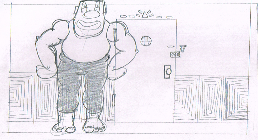
frank by the door, the walls where a bit funky also

frank by the door, the walls where a bit funky also

FRANK production blog 44

key poses.png

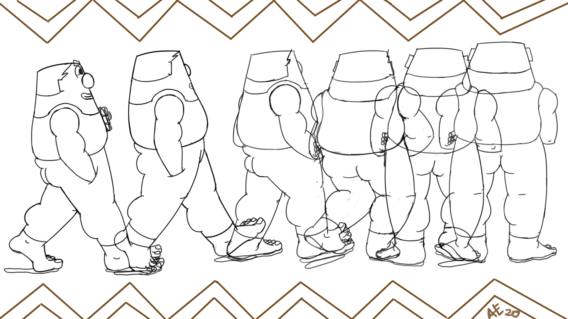
todays update is a pose sheet. these are some of the keys for the scene, i have been working on this for more then 1 month now. im really happy with the out come but there is still much todo before it is ready for color.

although im not active, i am devoted to my art and usually do a good job at putting time into it daily. some days are better then others. somedays i end up redoing the entire scene, however it is all for the best. i trust the process and dont want to rush because of FOMO. It will be ready soon but not till its done.

FRANK production blog 40

todays update is about the scene i been currently working on. the video below is taken from the original animatic put together about 4 years ago. it is very raw and is probably the truest expression of FRANK that i have done. since then i made cuts in order to save time, however i have currently gone full circle. as i continue to refine the film i have decided i do not like the updated version and started thumb nailing this version. i have roughed out the animation and put it together in order to improve my options for the final edit. next post will contain the updated version of this scene.

FRANK production blog 35

final draft of the scene

final draft of the scene

todays update is about one of the opening scene. Above is the final design still for scene. Below are a few different variations of FRANK smelling his roses.

We start with the first draft I did on a very old piece of hardware, about 3-4 years ago when I started putting together a rough animatic. My goal was to capture the movement of both FRANK and the roses.

1st draft, done on a very old cintiq about 3-4 years, got it from a friend as payment for a job

1st draft, done on a very old cintiq about 3-4 years, got it from a friend as payment for a job

Next we have the 2nd draft done about 2 -3 years go, this draft is just cleaner but the movement stayed the same.

2nd draft, done about 2-3 years ago on a 13 inch cintiq, borrowed from a friend

2nd draft, done about 2-3 years ago on a 13 inch cintiq, borrowed from a friend

We finally we have the 3rd version done about 2 year ago. Same movement but the roses have been cleaned up and detail has been included, making the next pass to be a simple clean up pass.

However the roses have been reanimated, I wasn’t happy with the shot so i decided to redo it, in the past I would have dreaded reanimation a shot, but after spending so much time with this project and my goal being to make it the best possible, I really did not hesitate on the idea. Once I said, I gotta re do this, I simply went and started. I knew it would take some time but it would be worth it. As of this post its almost complete.

3rd draft, done about 2 years ago

3rd draft, done about 2 years ago

FRANK production blog 29

todays update is some background comparisons on a scene i am currently cleaning up. not much more to say but that this scene was one of the first scenes i worked on when i started production a few years ago. this is one of the scenes that have not change much since the original boarding of the film. the brick patterns and layouts have evolved but the pots, plants and animation are still the same.

color studies

color studies

old color test

old color test

old storyboard

old storyboard

old storyboard with emphasis on the inside of the apartment

old storyboard with emphasis on the inside of the apartment

single frame of current clean up scene. the lines are for placement and continuity

single frame of current clean up scene. the lines are for placement and continuity

FRANK production blog 24

todays post is about animatics! this is the 1st time im posting any animation for the film on this blog. its something i look forward to doing more of especially after i start coloring the cuts. below i have FRANK smelling his roses and walking towards the window.

this cut is one of the opening shots of the film, this is the 2nd pass of animation with one more final pass left to do

this was the 1st pass of animatic edits for this scene, these are not the original boards, these where a more updated design to the boards, maybe the 2nd pass instead of the 1st. the 1st pass was done in green pencil, but these are just boards and no animation

this was the 2nd pass of animatic edits, but its actually the 1at draft of animation for the scene. i think this is one of the 1st scenes i animated about 3 years ago on what is possibly the 2nd cintiq ever made, ancient piece of tech but it served me well. FRANK smelling his flowers and walking off

FRANK production blog 23

tonights update is some old color study thumbnails from about 2 year ago. some ideas for colors for FRANKS apartment. these designs have change and so have the colors, but i enjoy looking at them because the 1st draft of anything is usually the closest most honest depiction of whats in your head.

FRANKS apartment color studies and pots

FRANKS apartment color studies and pots

FRANK production blog 19

i am terrible with setting deadlines, there i said it. i am pretty good at meeting them when they are set by a 3rd party but if i set it, i struggle with meeting them. this applies to my film. i have been working on it daily for a little over 3 years now. that's production work, pre production took longer then that but thats for other reasons.

well im ready to finish this film and set it free in the world, in order to do that i have to set a deadline and i have to work my ass off and try my best to meet the deadline. last week i was going through my scenes thinking it would take me about another year to finish it, i had given myself 2 week to finish every scene. thats 25 scenes 2 weeks per scene, equals a bit over a year.

to my surprise when i actually started doing the final pass, i was knocking out scenes very quicky. i think i did 2 scenes in a night, needless to say i was elated! this has shorten my production time by more then half. my new goal and deadline for final animation is may or june, definitely before summer.

im super happy about this, this has given my a new motivation. i am aiming to premiere FRANK before the end of the year, yay!!

the night i started doing the final pass

the night i started doing the final pass

one week progress, as you can see the green ones are complete and ready for color

one week progress, as you can see the green ones are complete and ready for color

FRANK production blog 17

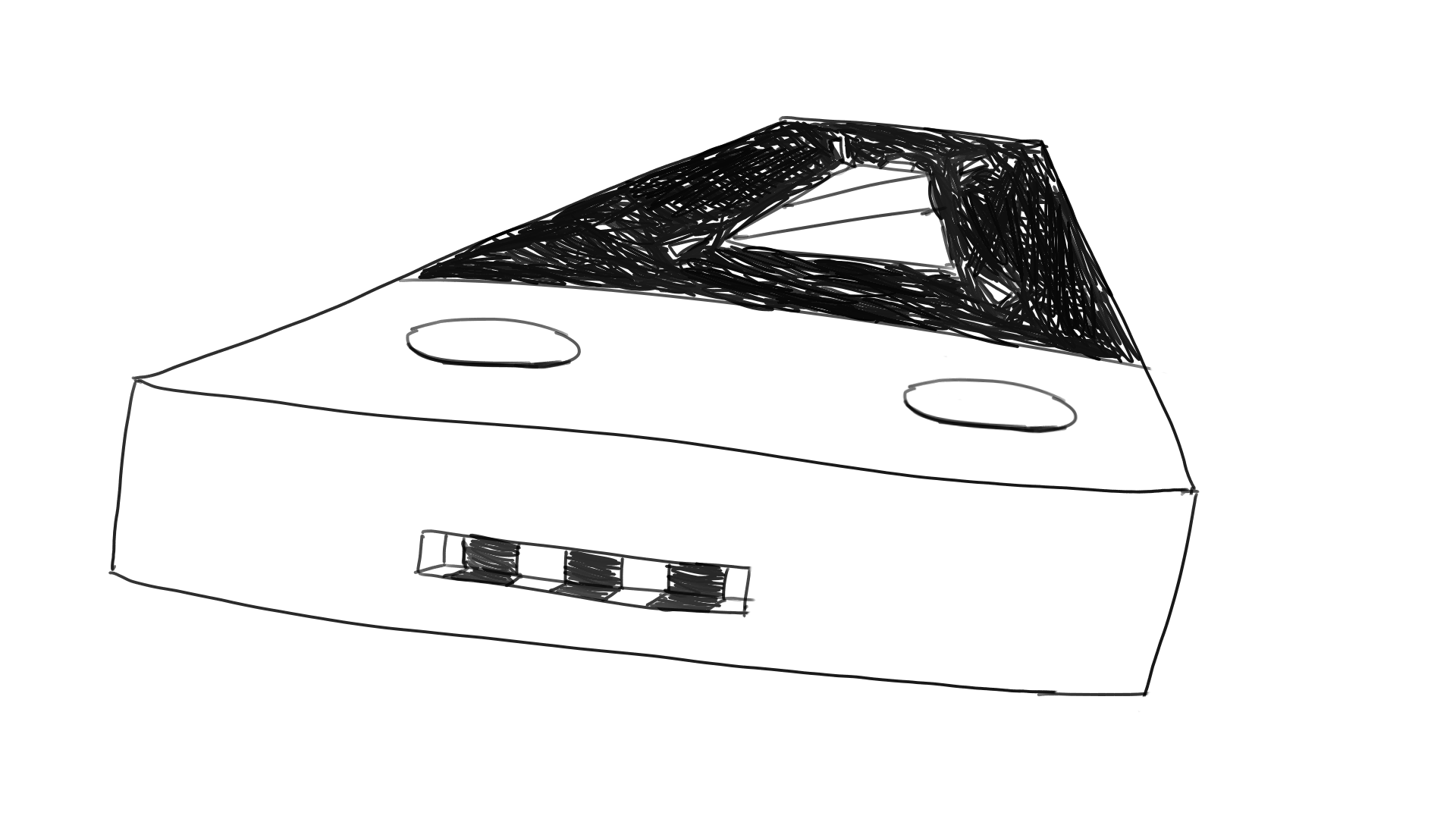
tonights update consist of the phone/gameboy

color study from about 1 year ago

color study from about 1 year ago

from the beginning i knew this device was to represent what we all have grown so dependent on, our smart phones. something fairly knew which we’ve gotten really attached to, some of us even have serious health side effects because of them. this phone/gameboy was something i was strongly pulled towards when first conceiving this project, partly because i really enjoy drawing it and partly because like most of us i use it daily and it has changed my life in many ways.

i think its very important for us to understand what this device does to our brains, that being said they arent a bad thing if you maintain a health balance.

below are some ideas of the evolution of this device, im almost sure what design i will go with but i still have some doubts at times on which version i like more and although all the animation involving it is pretty much complete.

1st draft of game boy, way back in 2015

1st draft of game boy, way back in 2015

this draft was more in the smart phone direction

this draft was more in the smart phone direction

smart phone design also

smart phone design also

gameboy design with smaller controls and larger screen

gameboy design with smaller controls and larger screen

gameboy design with different buttons

gameboy design with different buttons

closer to the final design, kinda looks like micky mouse..lol

closer to the final design, kinda looks like micky mouse..lol

had settled on this one but recently changed my mind…again..

had settled on this one but recently changed my mind…again..

i selected this as the main distraction in FRANKS life because i strongly feel that this is/can be a distraction in most of our lives. its cool and new and can come into our life without warning, it consumes all our time and attention thus ending with us ignoring whats most important to us. this is what this little thing represents in my film. i hope i can accurately convey these thoughts with these drawings in motion

color study

color study

FRANK production blog 15

todays update consist of a few drafts of the final (?) shot of this project. here we see a few different thoughts on what the final shot would look like. i am almost done with the backgrounds, they are taking longer then hoped but what doesn’t when it comes to making art..

thumb nails of what the final shot could look like, along with some some rough key frames of the animation

thumb nails of what the final shot could look like, along with some some rough key frames of the animation

a value study and the original final shot for the animatic but not the storyboards

a value study and the original final shot for the animatic but not the storyboards

a version closer to the final layout

a version closer to the final layout

some where along the process i decided to flip the building. i wanted to convey a sharp and un natural feel, something is out of place in the end, which is how the after math feels when we screw up in life. I also decided to distance the city, it suppose to give you a feeling of disconnect as well. does it do that well?, im not entirely sure, now that im uploading this im having second thought about its effectiveness…lol. there is much work left to be done but as always i look forward to taking it one day at a time.

a more updated version of the final layout.

a more updated version of the final layout.

FRANK production blog 10

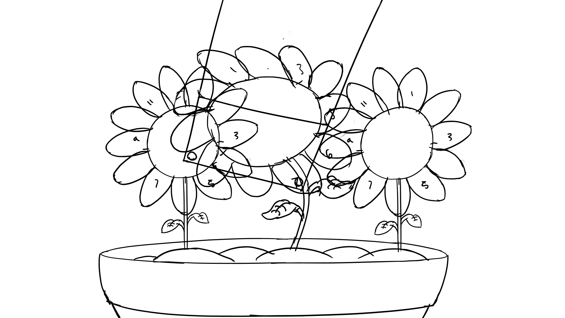
todays update consist of some rough key frames for a scene and a few old story boards. this scene has been a lot of fun to work with, pretty easy and simple action to animate. the biggest challenge has been the flowers, trying to keep count of all the petals and their size in every frame. non the less the scene has been easy and fun. it needs one more pass of clean up, and then on to coloring. the colors are subject to change a bit

rough back ground and colors for this scene

rough back ground and colors for this scene

more updated key frame

more updated key frame

more updated key frame

more updated key frame

more updated key frame

more updated key frame

more updated key frame

more updated key frame

old draft key frame

old draft key frame

old draft key frame

old draft key frame

old draft key frame

old draft key frame

old story board

old story board

more updated board with character design

more updated board with character design

old story board, possibly the 1st draft a very very long time ago

old story board, possibly the 1st draft a very very long time ago