todays update is a simple color study on the city that FRANK lives in. A few different city concepts with some different mood exploration.
backgroundart
FRANK production blog 31
today update is a back ground and a few of its versions.
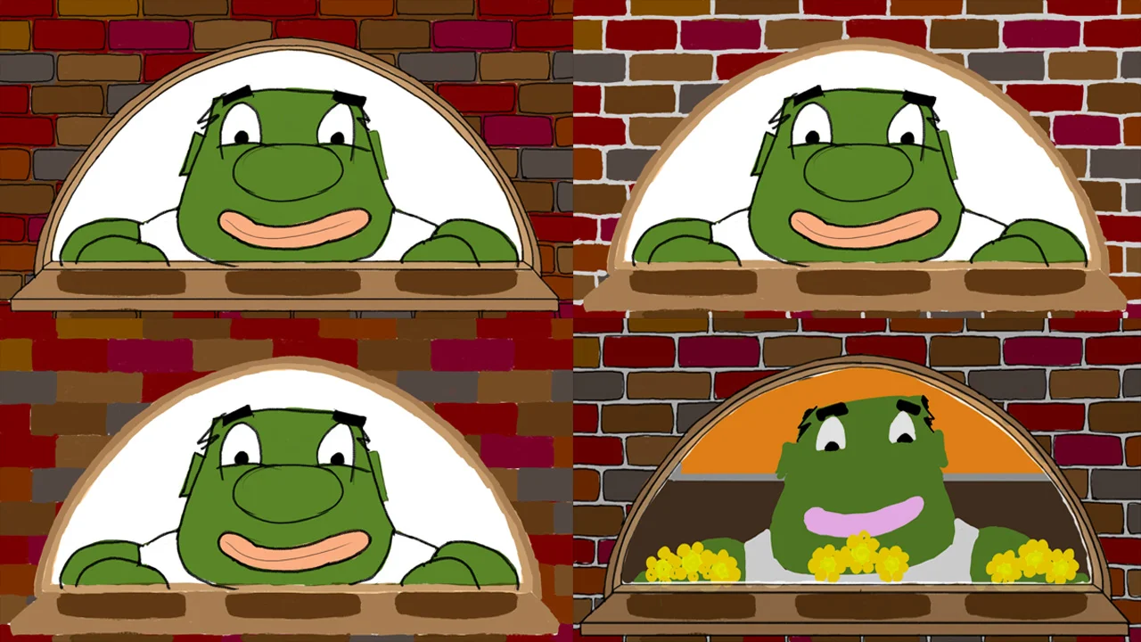
below is one of the wide shots of FRANK’s apartment. it is also the first time the we see his brick wall and window. this was one of the first backgrounds i drew when coming up with the story, its concept is pretty simple. i have always loved brick structures for many reason, one reason being brick will last a really really really long time signifying strength and endurance. its many small pieces fitted together to prop up one large structure. all the metaphors a side brick is made from the earth and have many color variations, these two things alone where enough for me to select it. i also dated a girl who lived in an old Brooklyn apartment with a brick wall…(there is definitely something subconscious there)
almost final version, done in tvpaint
early draft for animatic usage
first draft, done on animation paper with pencil and ruler
FRANK production blog 15
todays update consist of a few drafts of the final (?) shot of this project. here we see a few different thoughts on what the final shot would look like. i am almost done with the backgrounds, they are taking longer then hoped but what doesn’t when it comes to making art..
thumb nails of what the final shot could look like, along with some some rough key frames of the animation
a value study and the original final shot for the animatic but not the storyboards
a version closer to the final layout
some where along the process i decided to flip the building. i wanted to convey a sharp and un natural feel, something is out of place in the end, which is how the after math feels when we screw up in life. I also decided to distance the city, it suppose to give you a feeling of disconnect as well. does it do that well?, im not entirely sure, now that im uploading this im having second thought about its effectiveness…lol. there is much work left to be done but as always i look forward to taking it one day at a time.
a more updated version of the final layout.
FRANK production blog 11
Below are some screen shots of my work space. I use TV Paint 11. Its a very easy software to learn. Its specialize for 2D animation and works amazing. Frank will be my third animated cartoon using the program. It come from France and has been around for a while now.
I used the standard Adobe Flash when I was in art school and for some freelance projects after graduation. I didn’t like it so much, there are a few reasons why but i honestly think I am just bais towards it.
I been using TV PAINT for a while now and just keep loving it more and more. Im not very fluent with all that the programs offers, I have my methods and I stick to them however old school they may be.
There are two versions of the program, the student version and the professional version. https://www.tvpaint.com/ check the site out for all the details
Still from FRANK
Still from FRANK
The process of backgrounds
I’ve said it before and I’ll say it again, animation is a long process! There is something to be said about the character of those who willingly choose to embark on these roads. It’s pay off is something that only the sweetest of fruits can compare to. You start with and Idea and through sheer will you give that idea life, you bring it into the world, you will it into existence, that is something very few can do and even fewer enjoy doing it over and over. So animators are of a special breed of artist, not everyone is cut out to be an animator but everyone can enjoy animation.
Above is a page from my updated storyboards for my current project FRANK. This was the 2nd pass of storyboards. It was the final pass for this scene. I was very happy with the action and the framing and so I did not feel the need to reboard it more a 3rd time. The action is pretty clear, Frank our main character is smelling his flowers by his window.
Above is one of the 1st drafts I did for the background, Like I previously stated I was pretty happy with the framing and original design idea, and so it was pretty easy to draw something and approve it. Below is the 1st draft I did on paper, I used animation size paper with and HD field guide, while I was happy with the outcome I ended up not using it, It felt to stiff and not exactly what I wanted. I remember I did all the backgrounds on paper thinking I would scan them and use them as finals but I ended up going with digital finals instead.
Next came the color versions of the background. Now I will be the 1st to admit that while I love color I am pretty terrible at it. I tend to select colors I love but don’t have much of a understanding on how to balance them. Maybe I just need to experiment more.
I done a few different variations on the brick wall, not completely sure on which one I want for the final design. That being said Im not completely sure on what the final vision for the film should be, when it come to style. While I have completed much there is equally if not more work that needs completion, so I will continue to cultivate that will and give life to this beautiful art form, for there is no grater feeling then seeing something complete from start to finish.


