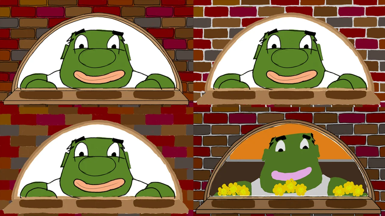
tonights update consist of the phone/gameboy

color study from about 1 year ago
from the beginning i knew this device was to represent what we all have grown so dependent on, our smart phones. something fairly knew which we’ve gotten really attached to, some of us even have serious health side effects because of them. this phone/gameboy was something i was strongly pulled towards when first conceiving this project, partly because i really enjoy drawing it and partly because like most of us i use it daily and it has changed my life in many ways.
i think its very important for us to understand what this device does to our brains, that being said they arent a bad thing if you maintain a health balance.
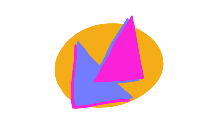
below are some ideas of the evolution of this device, im almost sure what design i will go with but i still have some doubts at times on which version i like more and although all the animation involving it is pretty much complete.

1st draft of game boy, way back in 2015

this draft was more in the smart phone direction

smart phone design also

gameboy design with smaller controls and larger screen

gameboy design with different buttons
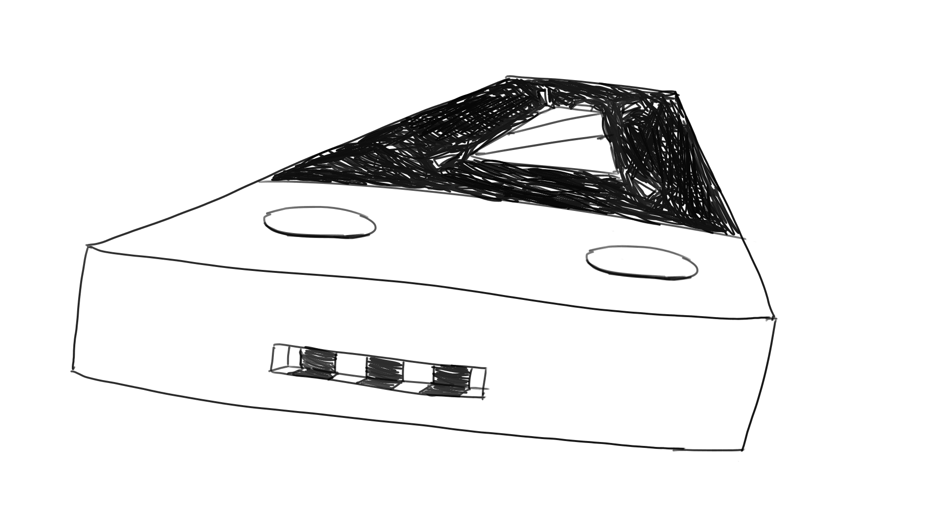
closer to the final design, kinda looks like micky mouse..lol

had settled on this one but recently changed my mind…again..
i selected this as the main distraction in FRANKS life because i strongly feel that this is/can be a distraction in most of our lives. its cool and new and can come into our life without warning, it consumes all our time and attention thus ending with us ignoring whats most important to us. this is what this little thing represents in my film. i hope i can accurately convey these thoughts with these drawings in motion

color study